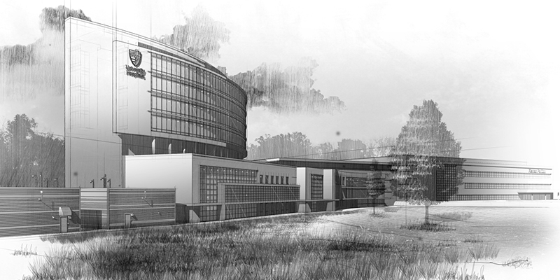
University Hospitals Illustration Breakdown
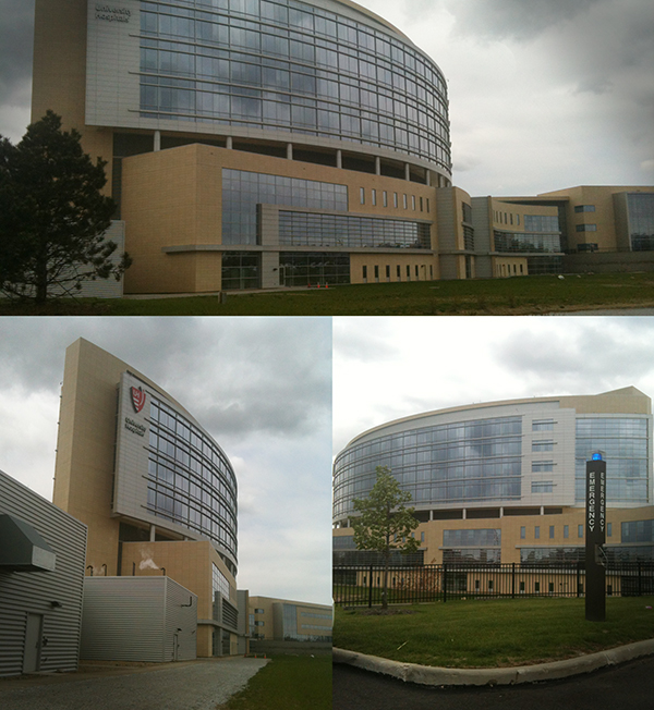
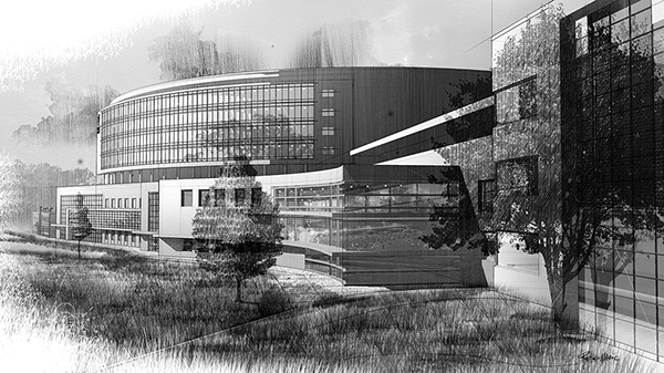
Every week while driving to Tri-C to teach, I would pass the University Hospitals building and think to myself ‘I want to illustrate this’. I love the contrast of the big curved elements against the angular geometry. During my lunch breaks I would drive around this building taking reference photos to start modeling from. Since I did not have blueprints to work off of, I used my reference photos.
I wanted this personal project to be about the exploration of a soft digital look as popularized by artists such as Dennis Allain, Studio JDK, and Jeff Stikeman. I searched the internet and came across this tutorial on creating a pencil drawing from a SketchUp model: http://www.alexhogrefe.com/blog/2012/9/9/sketches-part-2-extended.html.
SketchUp is a tool that I got away from over the past couple of years. After seeing work that artists are creating using SketchUp, I was blown away and wanted to give it a try again. Check this piece out: http://www.ronenbekerman.com/making-of-mediterranean-house-nookta/. My illustration is quite different from this link, but seeing this work made me realize that SketchUp is a robust tool for architectural illustration work.
The University Hospitals Ahuja Medical Center was the global architecture firm HKS Inc.
01 Reference Photos
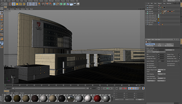
02 C4D Model
I modeled this building using Cinema 4D. I’m much faster using Cinema 4D for modeling than SketchUp. That’s why I choose this route for the creation of the geometry. After playing around with sketch and toon for a while, I was not able to achieve the line quality I was looking for, so I used SketchUp for the final export of the multi-pass layers.
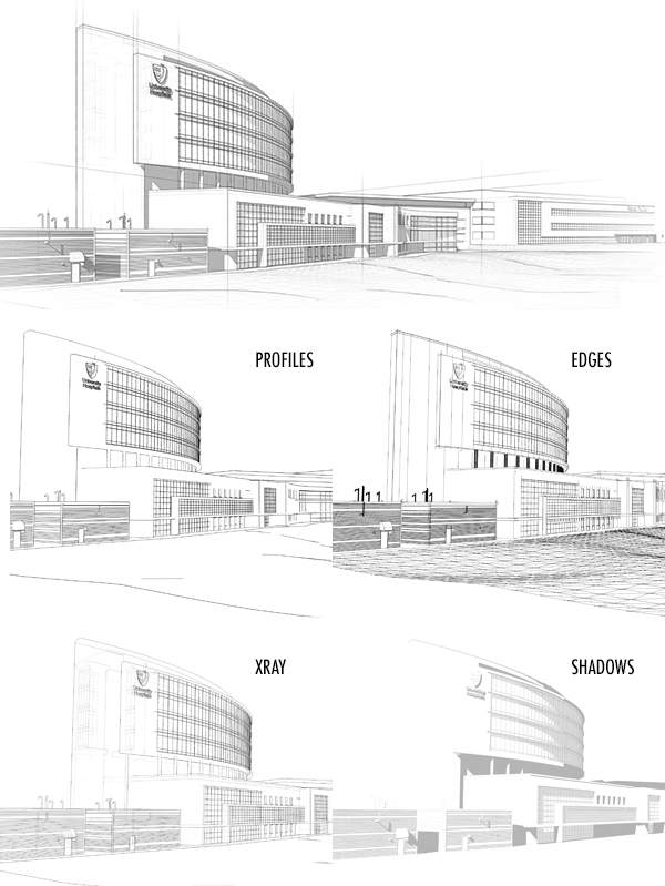
03 SketchUp Export
It’s so easy to get great linework out of SketchUp. With all the pre-built styles available, exporting a 2D graphic is a no brainer. I always export my lines in multiple passes. Pass 1, profiles turned on. Pass 2 , edges turned on. Pass 3, xray. Pass 4, profiles and edges off, and shadows turned on. Once I have all the passes re-assembled in Photoshop, I’ll add another layer and draw in a few construction lines on top of the model.
04 Creating Custom Brushes
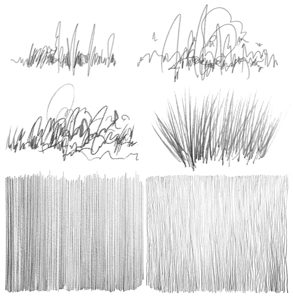
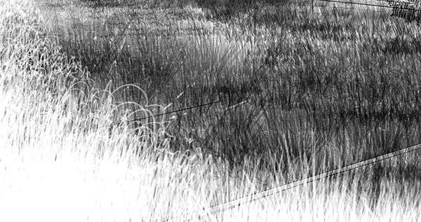
Fun part! At this point I pulled out my sketchbook and started drawing linework for the creation of custom brushes in Photoshop. I wanted to have a few different line types to choose from so I created a several grasses and variations of straight and wiggly lines. Once the lines were complete, I scanned them, did a few adjustments (curves, contrast, etc), and made new brushes in Photoshop.
05 Rendering
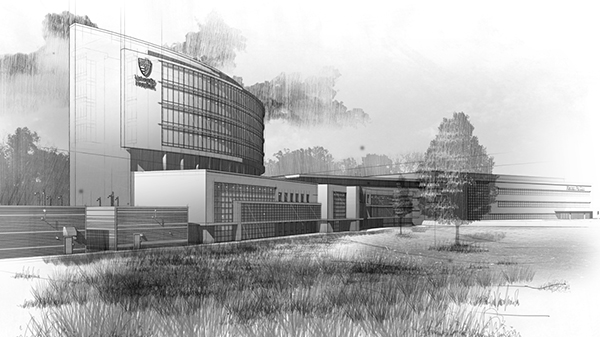
I almost always start my renderings by adding in a sky. This sets the mood for the entire illustration. For this piece, I used a photo of a dusk sky, desaturated the color, and turned down the opacity. After that, I dabbed in some clouds using Photoshop brushes then overlaid them with my custom line work.
For the ground cover, again I used custom brushes from my sketchbook line drawings. For the foliage, I imported tree photographs from my library and overlaid these as well with custom lines. I left the photos inside the illustration, desaturated them and turned the opacity way down.
06 Final Tweaks
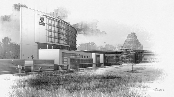
With the rendering complete, I placed a watercolor texture on top of the layer stack and set the blending mode to multiply. I felt the overall piece could benefit from a curves adjustment, so I added one to give the illustration more contrast between light and dark tones. Finally I grouped my lines and rendering together and masked out the entire illustration for the faded out look on the edges.
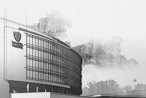
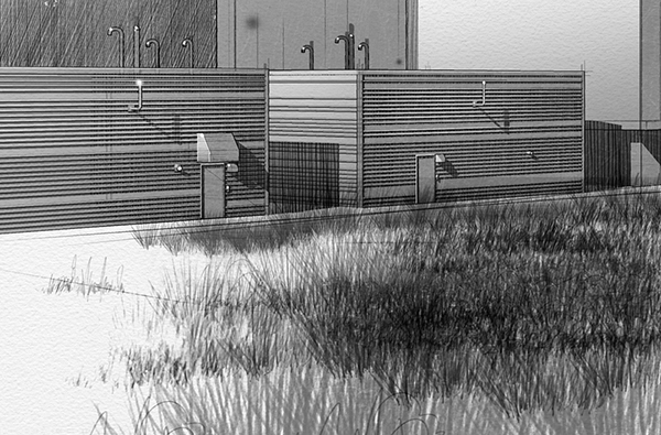
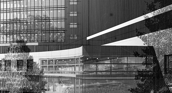
Below are a few detail shots and a second view I created from the same model.
Enjoy.


Wow! Really nice Tutorial and the final images are OUTSTANDING. Really impressive Technique. Thank you for sharing!
Thanks so much Jaime! Good to hear that you enjoyed this project breakdown.
This is a great tutorial……your work is always inspiring. i purchased your video a while back on the gomediazine site and i loved it……i can not tell you how much i learned. Hope you have a chance to do some more videos !!!! Thanks again….
Thank you Erin! I’m happy to hear that you found the video training helpful. If you ever have any questions, you can always email me direct at [email protected]. I’d love to see some of your work, please share a link if you have an online portfolio.
Hi, Pete. I was at the NAWIC meeting last night. Your presentation was GREAT. It was down-to-earth, informative and motivating. I found this tutorial specifically interesting because I was part of the construction management team that built the UH Ahuja Medical Center. The building is as beautiful on the inside as it is on the outside.
Thanks for making time for NAWIC. We really enjoyed having you.
Judy
Hi Judy,
It was a pleasure presenting at the NAWIC meeting, I am happy that I was invited to do so.
I pass the UH building every time I teach at Tri-C and love the design. I had to illustrate it as a practice piece.
Thanks for writing and keep in touch.