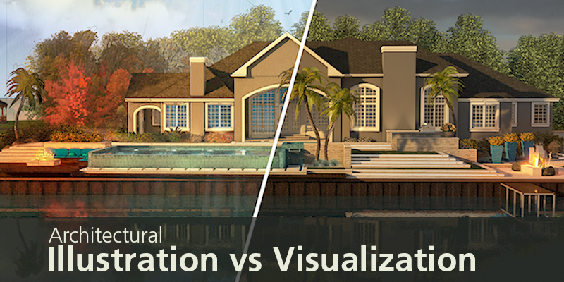
Architectural Illustration vs. Architectural Visualization
Have you ever browsed photos online and caught sight of a really beautiful home interior that looked too good to be true? Perhaps it had beams of light pouring in and reflecting off a glass staircase, or panels of mirror-polished black marble embedded in the wall behind a waterfall.
There’s a very good chance that these were not photos, but the end product of Architectural Visualization. That’s right, it was all 3D rendered to look like a photo. Did it catch your eye? Did you think ‘wow, I’d love to be in there and see more’? This means that the original artist and client hit their mark spot-on.
Architectural Visualization is the process of creating photorealistic images of ‘to-be-built’ products and architecture. It’s the shiny, polished, cherry on top that strives to be as close to the final product as possible, so a client can really visualize their creation.
Architectural Illustration
Think of illustration as a well-flushed-out ideation. It has a hand-drawn look, while still conveying the product accurately and attractively. It’s faster to create than the 3D visualization, so minor adjustments can be applied relatively quickly. For this reason, it’s often used in the first stages of a project for concept development.
Process
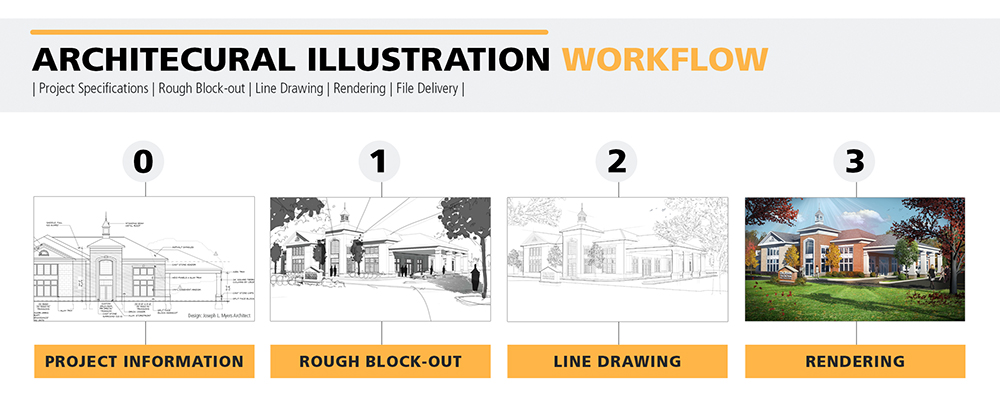
The magic starts with information. Say you’re working for a hotel, and they want a new pool. The architect or project manager hand over as many details as possible, from floor plans, elevations, and materials to finishes, fine details, and small requests. After the budget is decided and hands shaken, the process begins. Artists create a rough block-out sketch and email it over to the client for approval, who may request revisions. After any adjustments are made, the artists create a nice, detailed line drawing, which is then rendered in Photoshop with color, light, shadow, and texture.
Pros and Cons
Perhaps the largest advantage that Architectural Illustration has over Architectural Visualization is speed. It’s either drawn by hand or created from a 3D model as the basis, and textured/colored in Photoshop. The shorter timeline additionally means that it’s less expensive than the more involved 3D process.
This is also one of its downfalls, though. If the client asks for a different point of view, an entirely new picture has to be created. Same goes for changes in structures, details, or the base concept itself. Your end product is still an illustration, even if it’s a good one. You can’t rotate perspective or make a walkthrough video without investing additional time and money.
Architectural Illustration Portfolio Samples
3D Architectural Visualization
…And this is where the big guns of 3D are brought out. So, you’ve got your new indoor pool designed. You went through a few concepts, and now the architect or hotel manager, your clients, fell in love with the design… but want to see how it would look in real life. Though it takes longer and costs more, Architectural Visualization produces an easily-rotatable, photorealistic image that can be used for final presentations and publicity campaigns. Sounds great, right? Hold up for a moment, though. There’s a reason you wait till you’re at the final design phase.
Process
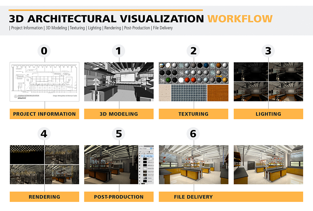
Architectural Visualization starts in a similar manner to Architectural Illustration: the client provides as many details as possible. This includes floor plans, elevations, materials, finishes, and special requests (sound familiar?).
Step one is 3D modeling. Artists import reference images to their respective programs and create an untextured, unlit 3D version of the product or architecture, using the supplied specs as proportion guides. Typically the workflow is walls first, then windows, ceiling, floor, and remaining components such as furniture and decorations. After the time-consuming step of 3D modeling, things get complicated and more involved to change.
Step two is texturing. The materials the client provides are pulled into Photoshop and adjusted for symmetry and tiling. Then they’re imported into the 3D scene and ‘wrapped’ over their respective geometry in a process called UVing (think of making sewing patterns, but for a room).
Next comes step three, lighting. This is one of the most important parts of creating the scene, and has potential to be one of the most finicky, too. Fortunately, it brings the artists to step four: rendering.
Rendering is the big sigh of relief, the first great fruit of the 3D process (for the client, at least, since it’s tangible). The computer essentially takes a snapshot of the scene with all the textures and correct lighting, calculating exactly how things should look. This can take as few as fifteen minutes for a single picture, or for more complicated scenes, several days.
After you get that unprocessed 3D rendered image, it’s time for the fifth step, post production. The picture is brought into Photoshop, every multi-pass layer adjusted individually for increased appeal and impact. Then more adjustment layers are added on top, fine tuning everything from color saturation and lighting to blurs and tints.
The final step is potentially every involved party’s favorite: file delivery of beautifully rendered 3D images that convey the feeling of experiencing your architecture.
Architectural Visualization Portfolio Samples
Pros and Cons
From an outsider’s point of view, it’s difficult to realize exactly how much work goes into creating essentially anything good in 3D. This is perhaps Architectural Visualization’s biggest downfall, because the complexity equals time, and time equals money. Since so many small, tedious parts create the scene as a whole, making major changes can be time-consuming and expensive depending on how far along the project is in production. A 3D concept can become inflexible versus illustration once locked in later stages of development.
On the positive side, the end product is far cleaner, and can be seen from multiple different angles without being recreated from scratch. This makes Architectural Visualization ideal for later stages of a project, when the concept is down pat and ready to meet the world with a clean face and pressed suit.
That’s perhaps the biggest difference between these two techniques of presenting a concept: what stages of development they are appropriately applied to. Architectural Visualization is the businessman prepared to present, versus the imaginative designer sketching down ideas (Architectural Illustration). Everybody loves the ideas and their flexibility, but to catch the attention and clarify a vision, something more realistic is sometimes necessary. In the end, though, they’re both vital, beautiful, and eye-catching in their own way, despite their differences in technique.


Good Article, But illustration looks much better than 3D
Thanks Saurabh! The project and client dictate whether we do illustration or 3D Viz.
Thanks for providing information. Doing great job!
Thanks John!
You have done an excellent job, thanks! The visualisation process is clear and comprehensible. As part of such a team, I can confidently say that the impression of the sketch and the finished photograph is very different. Just take a look at this example from iddqd studio.
A great article and very informative we are also from the animation industry.